PROJECT DURATION
September 2023 - December 2023
MY ROLE
Generalist UX/UI designer
TOOLS

Figma
THE PROBLEM
Numerous people embarking on a fitness journey struggle with organizing their workout routines effectively and maintaining a nutrition plan aligned with their goals.
THE GOAL
The core mission is to lead people towards their health and wellness objectives. We aim to achieve this by providing personalized plans tailored to each person's unique needs, while also fostering motivation throughout their journey.
Design process
EMPATHIZE
Interviews
User personas
User journey maps
Competitive analysis
DEFINE
User stories
Problem statements
IDEATE
Initial ideas
Storyboards
Information architecture
DESIGN
Wireframes & lo-fi prototype
Colors & typography
Mockups & hi-fi prototype
TEST
Usability tests
Iteration
Thoughts

Understanding the user
Users' desires and needs were studied in different ways, such as interviews, personas and user journey maps.
All of this revealed that an application of this nature not only provides personalized guidance to users but also serves to enhance motivation, adherence, and time management.
User pain points
UNAWARENESS
Many users face challenges in organizing their workouts and diets effectively
TIME
People with a very busy lifestyle find it challenging to make time for self-care
MOTIVATION
Due to not knowing how to organize their routines, many people lack the motivation to maintain a healthy lifestyle
User personas & problem statemets
Interviews and analysis of competitors' users were conducted to create two personas representing two main user groups. This facilitated a better understanding of the target audience.

David is a gym newbie who needs guidance on organizing his diet and exercise routines because he doesn't know how to achieve his goal of building muscle mass
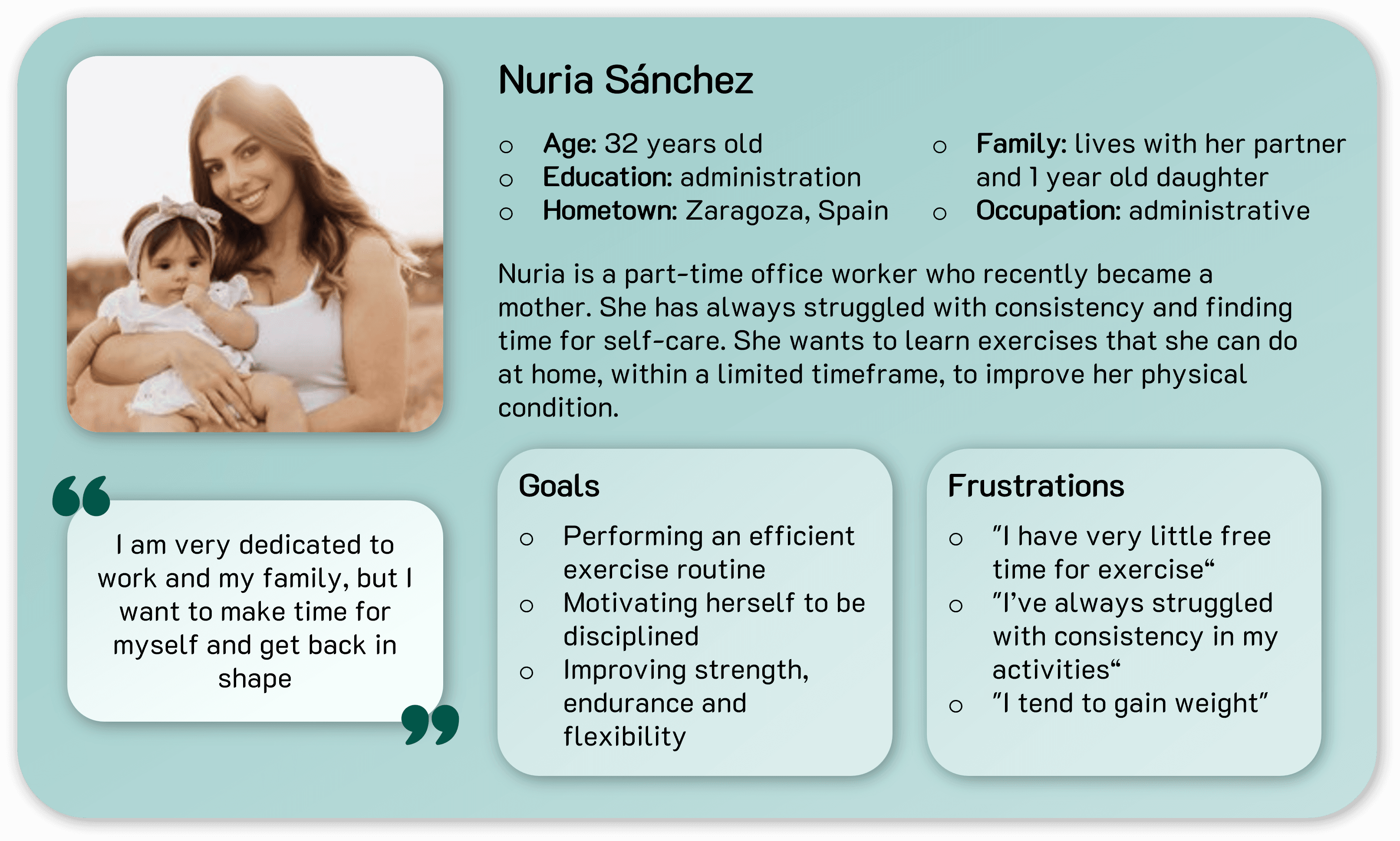
Nuria is a busy working mother who needs to prepare exercise routines to do at home and improve her diet because she wants to be in shape without compromising her duties.
User journey map
The creation of user journey maps helped empathize more with users and understand their needs.


Starting the design
I created the information architecture to organize the sections of the app. Then I proceeded with the first versions of wireframes on paper before creating them digitally.
Information architecture

Wireframes


Refining the design
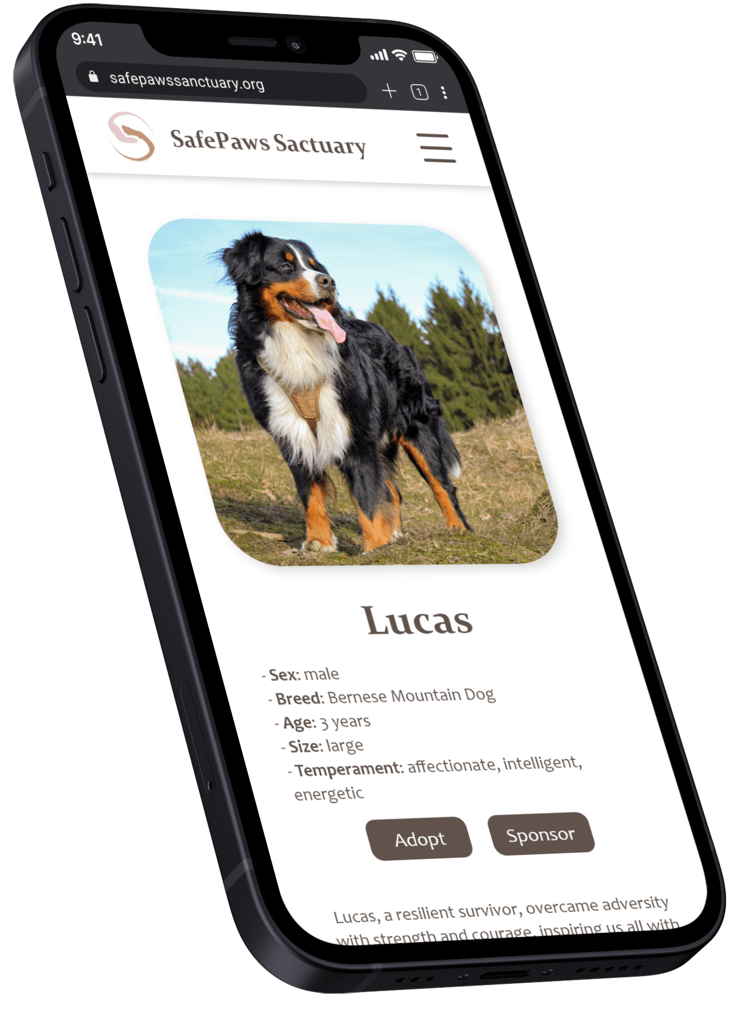
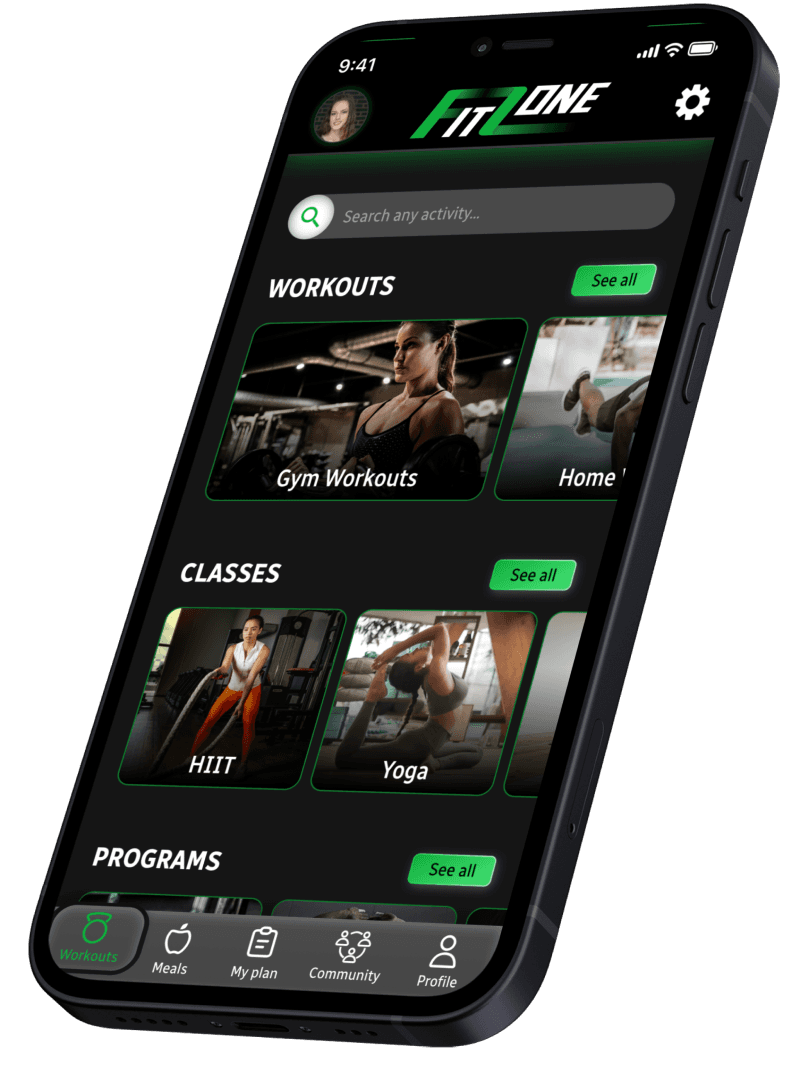
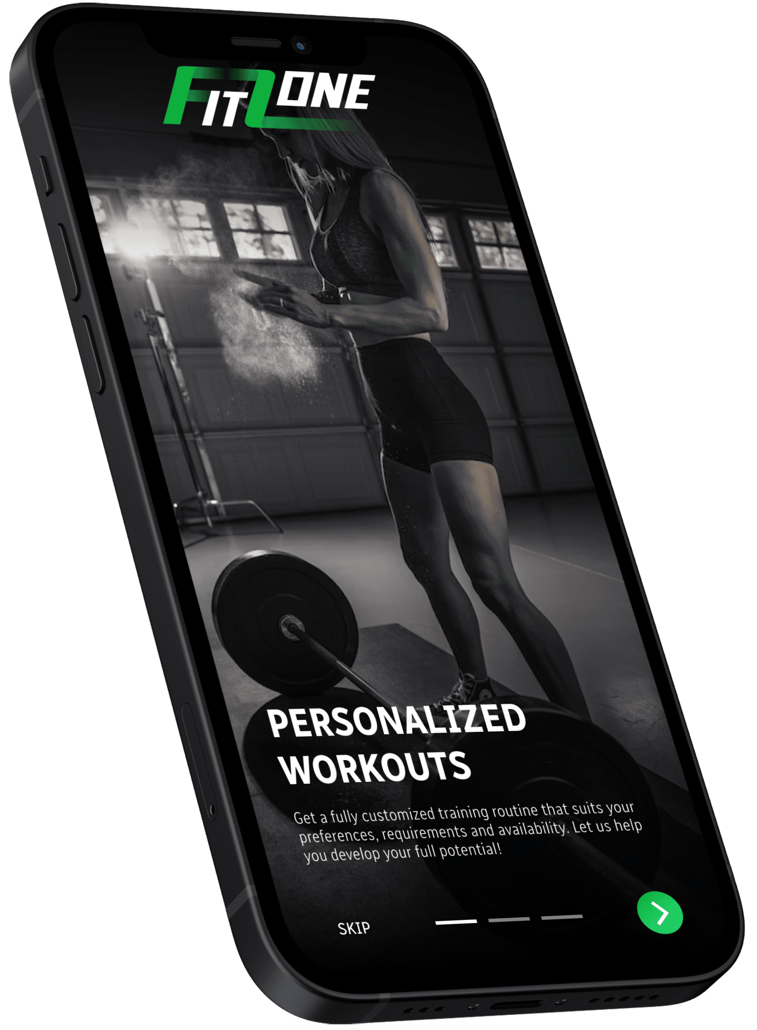
Thanks to usability studies, the designs were iterated until obtaining the final mockups expected to better align with the users' desires and needs. The complete high-fidelity prototype is available at this link.
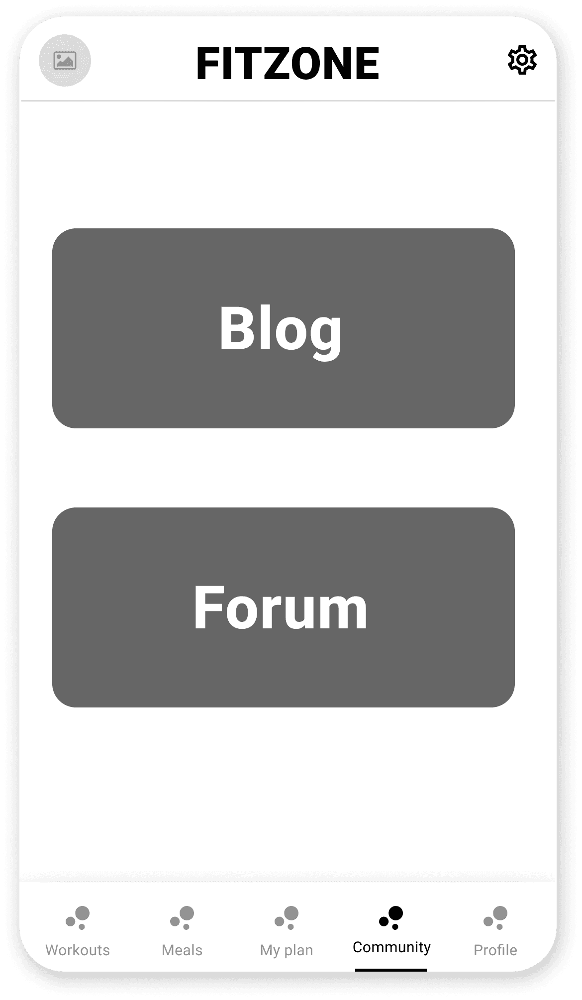
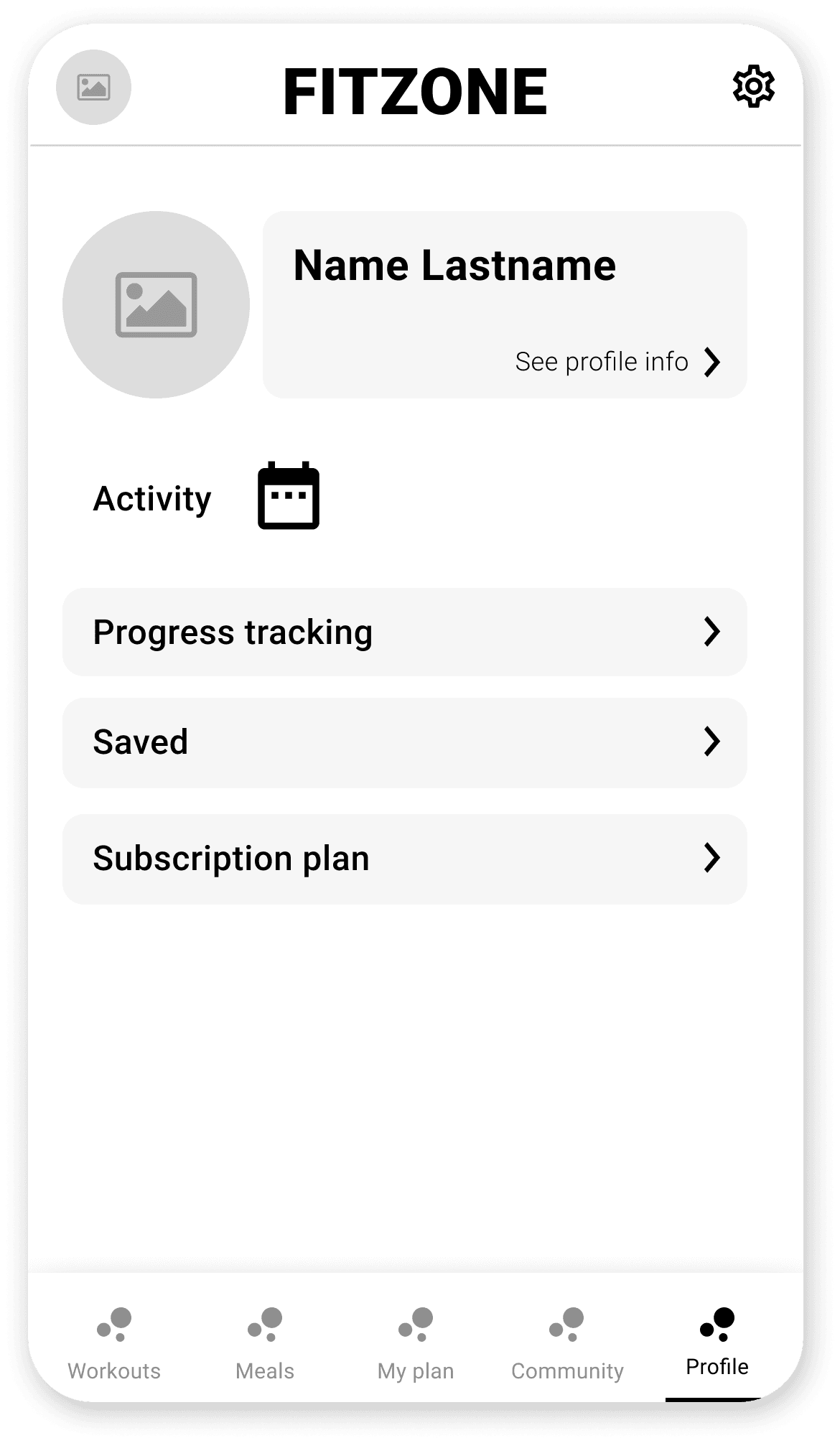
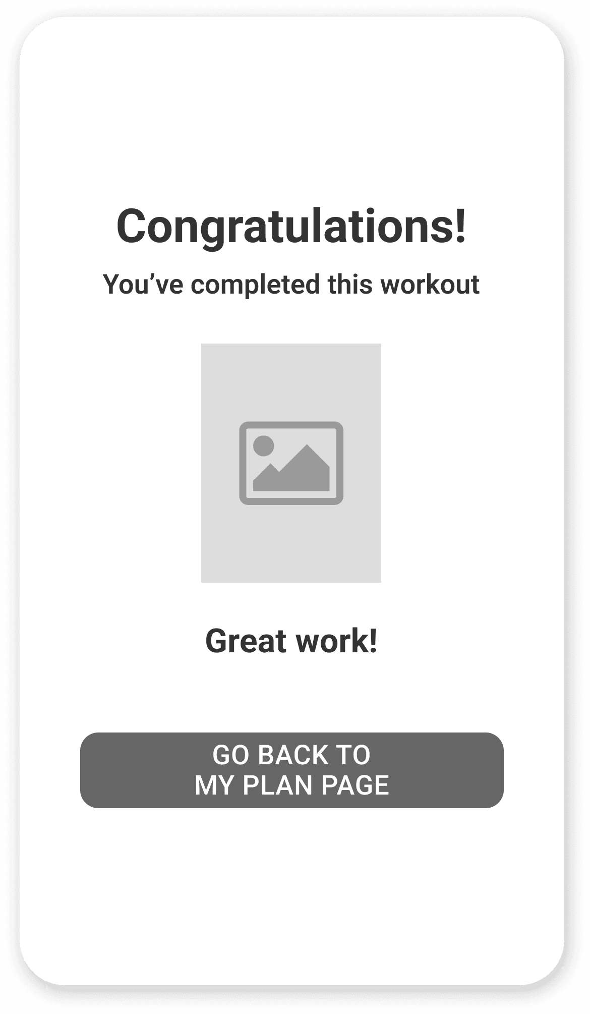
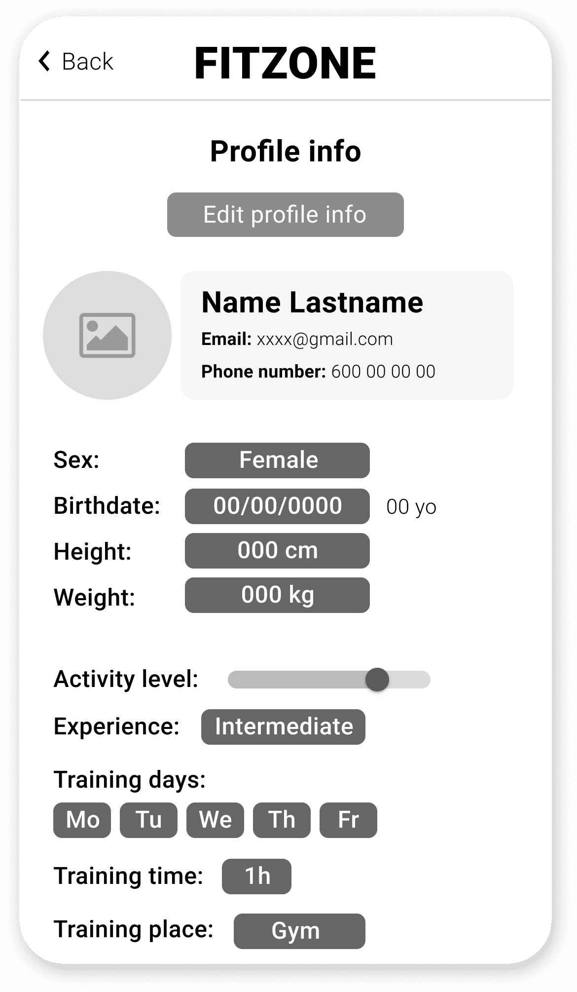
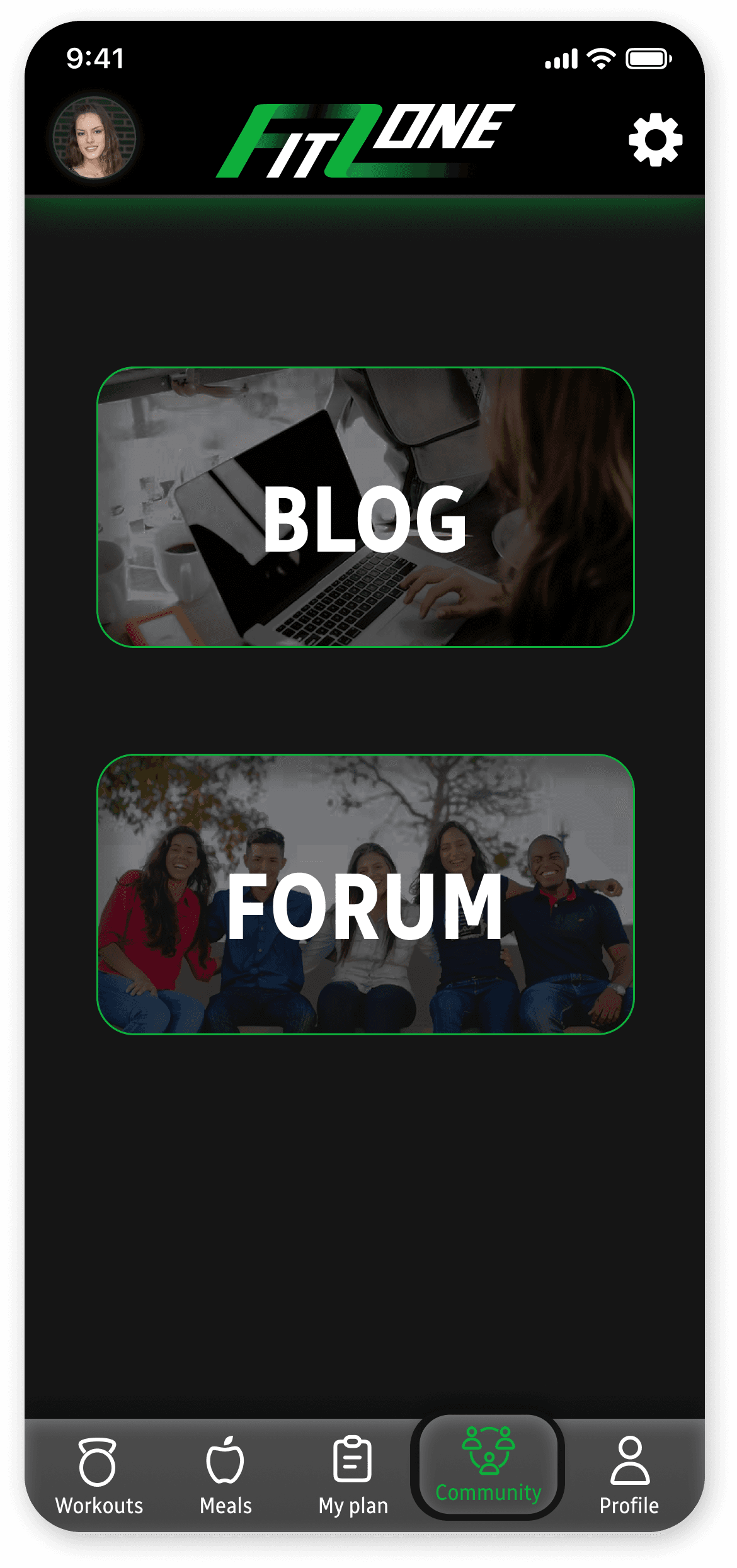
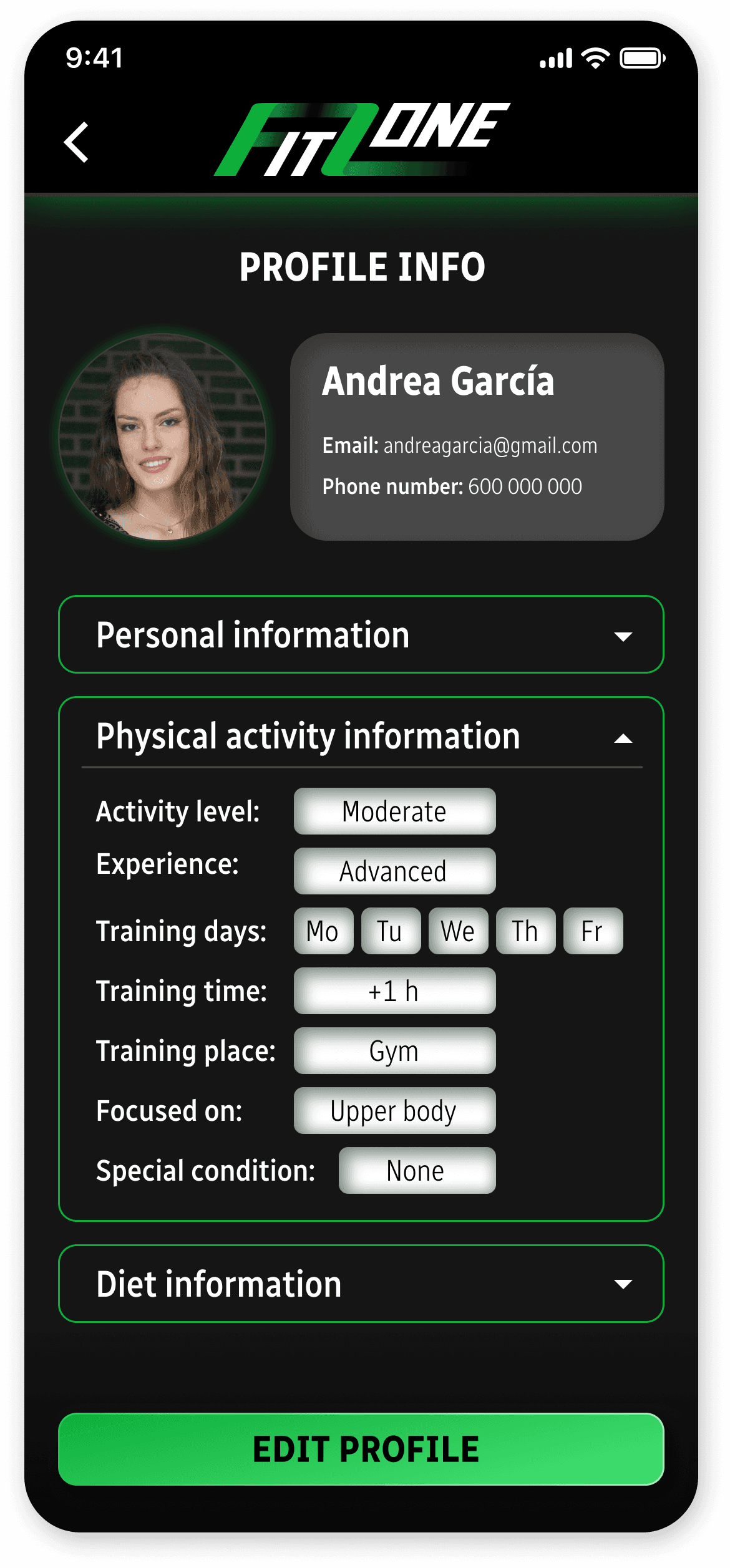
Mockups


Accessibility considerations
ICONS
Use of icons to make navigation easier and clearer. In addition, most of them are accompanied by text for easy interpretation by screen readers.
IMAGES
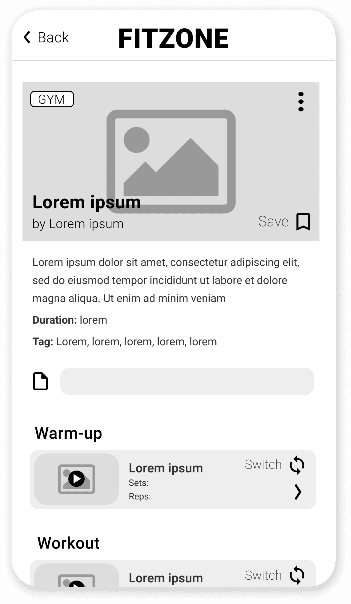
Use of videos for workouts and images for meals and blog articles to make it clearer and more pleasant for the user.
SUBTITLES
The videos of the workouts routines and classes are intended to be able to add subtitles.
Going forward
IMPACT
Participants in the usability studies find this app very useful and able to adapt to their particular circumstances.
A quote from one of them:
"I really like the app in terms of appearance and usability. I find it very comprehensive."
WHAT I LEARNED
This project taught me the importance of considering the wide variety of potential users and how there is always something to improve in designs.
NEXT STEPS
To further improve this app, another usability study with refined designs and more user research would be desirable.
It's important to target a wide diversity of people with different needs to create an pleasant user experience for everyone.