PROJECT DURATION
December 2023 - January 2024
MY ROLE
Generalist UX/UI designer
TOOLS

Adobe XD
THE PROBLEM
Animal lovers are unaware that there are several ways to contribute to animal welfare besides adoption.
Interested people find it difficult to easily get all the information they need.
THE GOAL
An eye-catching, clear and concise website so that users can easily get information and collaborate with the animal shelter.
Design process
EMPATHIZE
Interviews
User personas
User journey maps
Competitive analysis
DEFINE
User stories
Problem statements
IDEATE
Initial ideas
Information architecture
DESIGN
Wireframes & lo-fi prototype
Colors & typography
Mockups & hi-fi prototype
TEST
Usability tests
Iteration
Thoughts

Understanding the user
Users' desires and needs were studied in different ways, such as interviews, personas and user journey maps.
All of this confirmed the importance of an adequate design for a pleasant and useful web experience, and for a high conversion of users who wish to collaborate in some way with the cause.
User pain points
INFORMATION
Often, information on such websites is not presented in a clear, concise and accessible manner
COLLABORATION
Sometimes, the ways to collaborate and what they consist of are not adequately shown in a way that allows users to easily choose the one that best suits them
KNOWLEDGE
Useful information on pet care and other topics of interest to users is not always provided.
User personas & problem statemets
Interviews and competitive analysis were conducted to develop two personas representing two of the main user groups. This approach improved the understanding of the target audience.

Lidia is a newcomer to the pet ownership experience who needs to receive detailed information and advice because she wants to adopt a dog that fits her active lifestyle.

Rosa is a dog owner with a lot of free time who needs clear information and help because she doesn’t know what the adoption process is like.
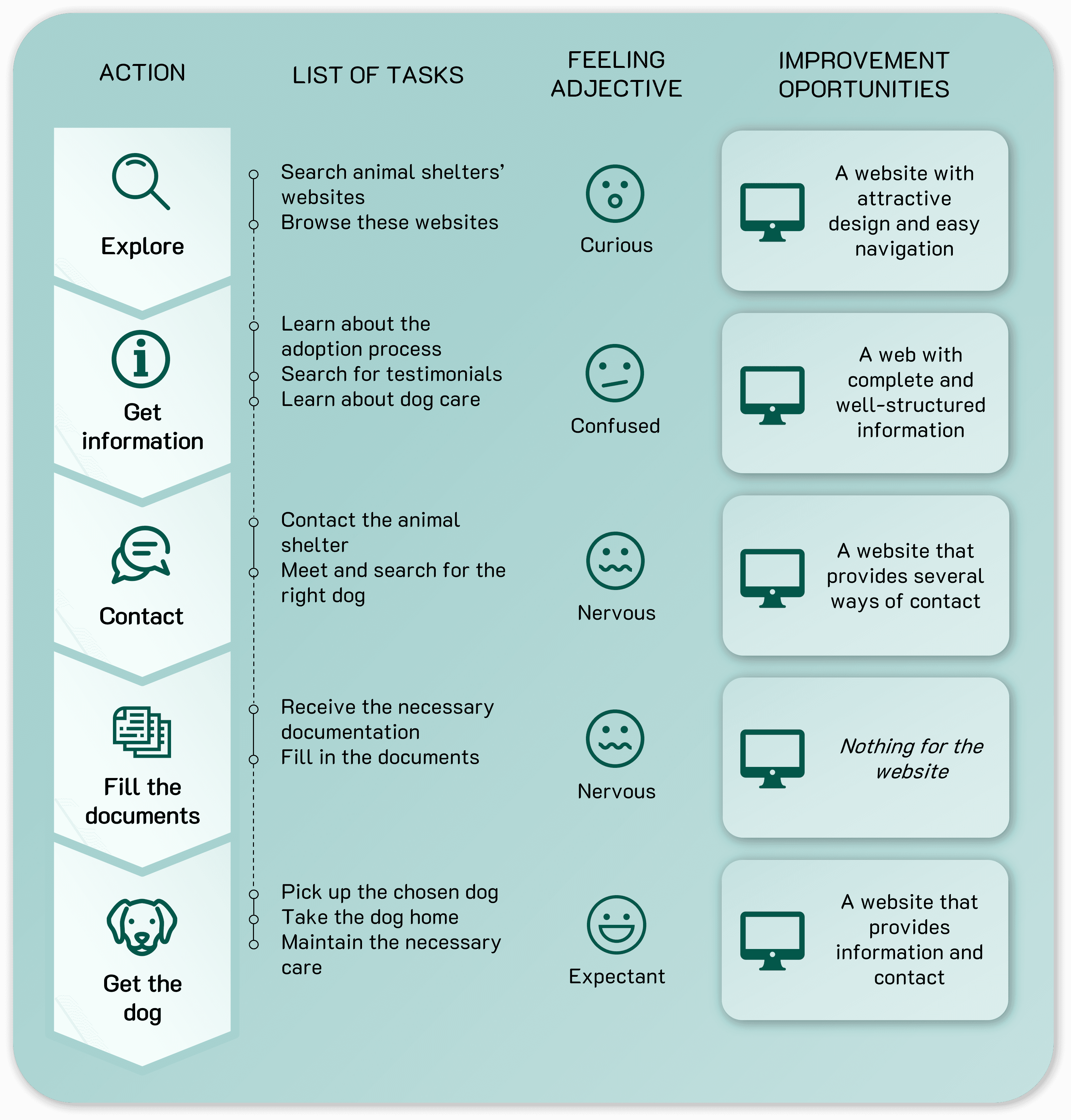
User journey map
Developing user journey maps allowed for greater empathy with users and deeper comprehension of their needs.


Starting the design
I created the information architecture to organize the sections of the website. Then I proceeded with the design of wireframes as the initial version.
Information architecture

Wireframes


Refining the design
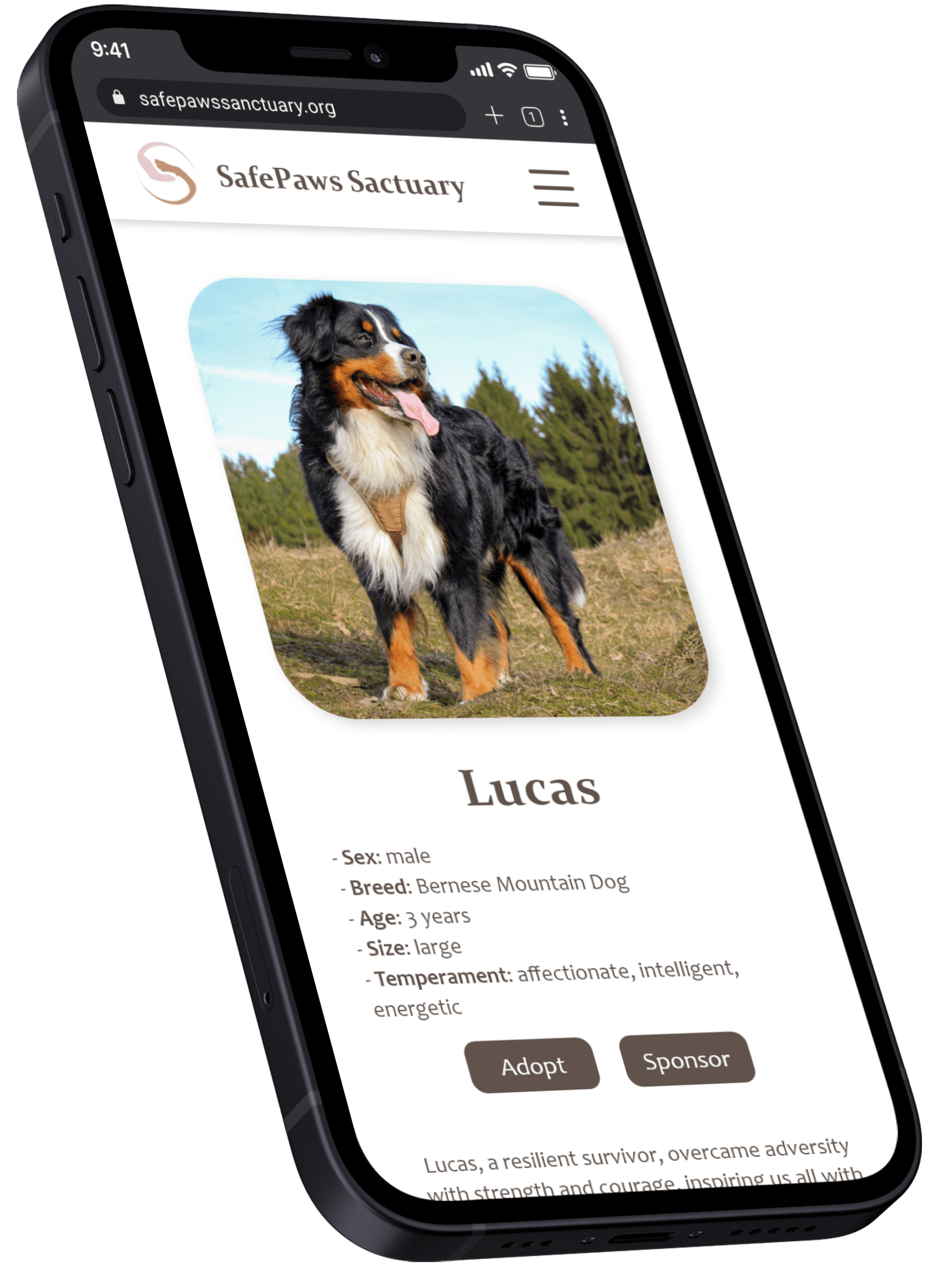
Mockups

Accessibility considerations
COLORS
I sought an appropriate contrast between the letter color and the background.
LAYOUT
I employed a correct grouping of the elements which, combined with the principle of similarity, helps their comprehension.
VISUALS
The use of images and iconography helps the quick understanding of the elements throughout the website.
Going forward
IMPACT
A website like this one could help an aminal shelter to get closer to the public and encourage their collaboration.
A quote from one participant:
"I hadn't found a website that held my attention so well and was so concise."
WHAT I LEARNED
In this project I learned that it is not only important what information is provided but how it is provided. It is very important to keep the user's attention and not overwhelm him so that he can continue browsing a web page at ease.
NEXT STEPS
It's important to keep iterating the website with feedback from target users to achieve a pleasant and useful experience for them.